COVID-19 Data Analysis with Python

Python provides a wide variety of packages for data analysis. Besides, Python has an easy-to-use language and great community support. Considering all these I decided to use Python for this analysis.
Importing required packages
We start by importing the necessary packages. I used pandas for Data Wrangling and EDA. Also, I used matplotlib, seaborn, and folium for data visualization.
Dataset
I have used the COVID-19 US Daily Data published on ALTADATA.
ALTADATA is a Curated Data Marketplace. You can sign up on altadata.io and access this data for free.
Gathering data
You need to subscribe to an ALTADATA data product to get an API key. Once you subscribe to the data product you can find your API key on your Account Dashboard.
We can easily obtain the dataset as pandas DataFrame with the ALTADATA python package.
Preprocessing the data
First, the rows that did not contain population information were removed from the data. Then blank values were replaced with zero. After that, the type of selected columns is changed to int.
Three separate data were generated for the last day, week, and month. These three data will be used in data visualization steps.
Exploratory Data Analysis (EDA)
Exploratory data analysis is an approach to analyzing data sets to summarize their main characteristics, often with visual methods. A statistical model can be used or not, but primarily EDA is for seeing what the data can tell us beyond the formal modeling or hypothesis testing task.
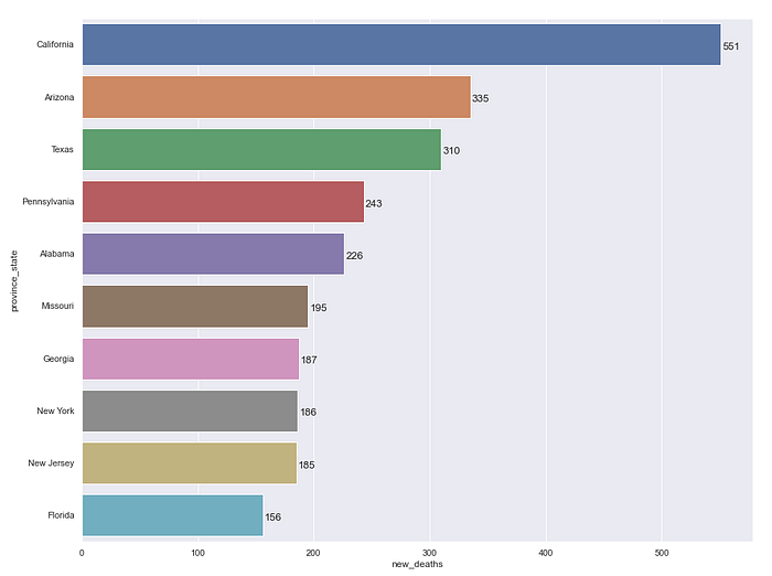
Top 10 States with the number of new deaths
I used a bar plot to visualize the top 10 states based on the number of deaths.
Data for ten states with the highest number of deaths were created in the last_day data. Then, the following bar plot was created with this data.
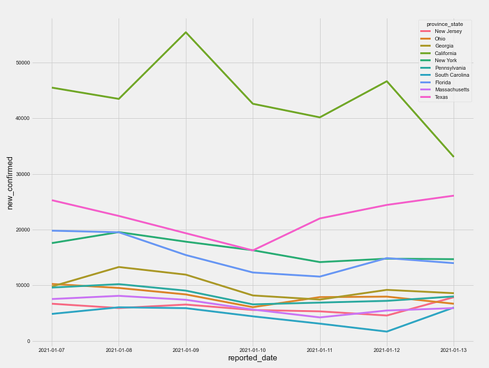
Top 10 States with the number of new cases
I used the line plot to visualize the top 10 states based on the number of cases.
Ten states with the highest number of cases were found based on last_day data. After that, data for the last week of these ten states were generated. Then, the following line plot was created with this data.
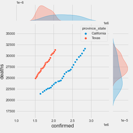
Relationship between the confirmed cases and deaths
I used Joint Plot to show the relationship between the number of cases and the number of deaths. I chose California and Texas, the two states with the highest number of cases, to show the relationship between the number of cases and the number of deaths.
Data for the last month were generated for California and Texas. Then, the following joint plot was created with this data.
USA COVID-19 Map
I used folium to show the COVID-19 data on the map.
folium makes it easy to visualize data that’s been manipulated in Python on an interactive leaflet map.
Using the respective coordinates, a generic USA map is created, with red circles representing the states and location pins with the pop-up content.

This visualization provides the opportunity to quickly access COVID-19 information on the map.
Conclusion
We analyzed COVID-19 data with Python. Apart from our analysis, there is much more you can do with Python and its powerful packages. So don’t stop exploring and create your own reports and dashboards.
Hope you find this article useful.
All code used in this article is available on GitHub.
If you want to support my work, you can buy me a coffee here.

